Part of The Complete Resume Guide for 2026. This post is one chapter in the pillar guide that covers format, ATS, keywords, tailoring, and role-specific examples end-to-end.
You spent hours nudging margins in Word and the PDF still looks different on every screen.
If you are searching resume formatting tips, you already know the pain: the design takes longer than the content. The worst part is that tiny formatting mistakes can make an ATS misread your resume entirely, or make a recruiter think you lack attention to detail.
Quick Answer: What is the best resume format in 2026? Use a clean single-column layout in 11pt Arial, Calibri, or Helvetica with 0.5 to 1 inch margins, no tables or text boxes, and save as a text-based PDF (or DOCX if requested). ATS systems parse this format reliably; multi-column layouts, tables, and images break parsing in the majority of ATS software, which is why a beautifully designed resume can score lower than a plain one.
The "Why": Why the old way fails
- Word and Google Docs export differently every time. What looks perfect on your screen breaks on theirs.
- Tables, columns, and text boxes confuse ATS parsers. Your carefully designed two-column layout might get scrambled into nonsense.
- Inconsistent fonts and spacing make you look sloppy. Even when your content is strong, messy formatting signals carelessness.
- Creative templates prioritize looks over function. That beautiful Canva template might be unreadable to both machines and humans.
The Fix: One-click formatting that stays ATS-safe
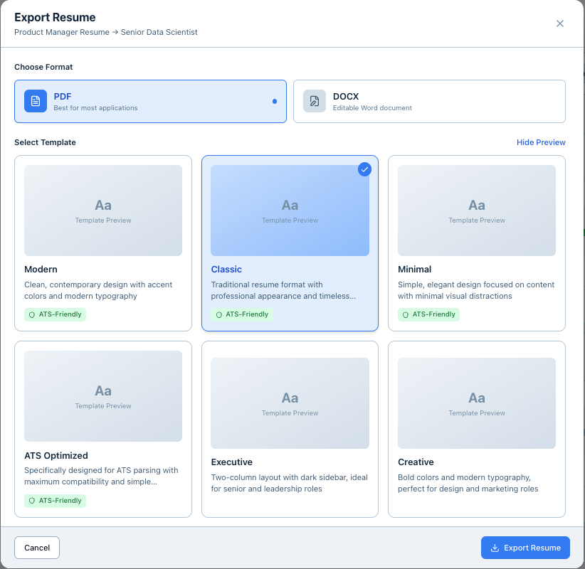
JobVouch uses one-click formatting through its Design and Export options. You pick a clean resume template, and JobVouch locks spacing, margins, and font hierarchy so every download is consistent. It is the only logical solution if you want speed and reliability.
The complete resume formatting checklist
Layout rules
- Stick to a single-column layout. Two columns confuse most ATS systems.
- Keep margins between 0.5 and 1 inch. Tighter margins look cramped. Wider margins waste space.
- Use consistent section spacing. Same gap between every section (typically 10-12pt).
- Align dates and locations to the right. Creates visual balance and scannability.
- Keep your resume to one page (unless you have 10+ years of experience).
Typography rules
- Use one font family from top to bottom. Mixing fonts looks unprofessional.
- Keep body text between 10 and 12 points. Smaller is hard to read. Larger wastes space.
- Use bold for section headers and job titles. Creates clear hierarchy.
- Avoid italics for large blocks of text. Hard to read and some ATS have trouble parsing.
- Do not use ALL CAPS for body text. Headers only.
Technical rules
- Avoid text boxes, tables, and graphics in the body. ATS cannot parse them reliably.
- Use simple section headers. "Experience" not "Where I've Made an Impact."
- Use standard bullet points (•). Fancy symbols may not render correctly.
- Save as PDF for submission. Unless the posting specifically asks for .docx.
- Name your file clearly. FirstName_LastName_Resume.pdf
What Margins to Use on a Resume
Resume margins are one of those details that seem minor but can make or break ATS parsing and readability. Here is what you need to know.
| Margin Size | When to Use | ATS Impact |
|---|---|---|
| 1 inch (all sides) | Standard, safe default. Works for most resumes. | Parses perfectly. |
| 0.75 inch | When you need slightly more space. Good for 1-page resumes that are a few lines too long. | Parses fine. |
| 0.5 inch | Absolute minimum. Only use if you have 10+ years of experience and need the space. | Some ATS may clip text near edges. |
| Less than 0.5 inch | Never use. Text gets cut off in print and may break parsing. | Risky. |
Our recommendation: Start with 0.75 inch margins on all sides. This gives you slightly more space than the default 1 inch without risking readability or ATS issues. If your resume fits comfortably at 1 inch, leave it there.
Common margin mistakes
- Different margins on each side -- Keep all four margins equal for a clean look.
- Reducing top/bottom margins but not sides -- This creates an unbalanced, cramped appearance.
- Zero margins for "more content" -- Content near the edge gets clipped by printers and some ATS parsers.
Want to check if your current margins and formatting pass ATS? Run a free ATS scan and see how your resume parses.
The best resume fonts in 2026
Searching for the best resume font 2026? The safe answer is boring and effective. Stick to clean, ATS-friendly fonts that render consistently across all devices.
Recommended fonts
| Font | Best For | Notes |
|---|---|---|
| Calibri | Most resumes | Default in Word, clean and modern |
| Arial | Conservative industries | Safe, universally readable |
| Helvetica | Design/tech roles | Clean, professional (Mac default) |
| Garamond | Traditional industries | Elegant serif, good for law/finance |
| Cambria | Academic/research | Readable serif, works well in print |
Fonts to avoid
- Comic Sans (unprofessional)
- Papyrus (dated)
- Script fonts (unreadable)
- Decorative fonts (ATS issues)
- Anything too thin or too bold
Common formatting mistakes (and fixes)
Mistake 1: Using tables for layout
Problem: ATS reads tables cell by cell, scrambling your content order. Fix: Use tabs and line breaks instead. Or use a tool like JobVouch that handles this for you.
Mistake 2: Headers in text boxes
Problem: Some ATS skip text boxes entirely. Your name might not get parsed. Fix: Type headers as regular text with formatting applied.
Mistake 3: Inconsistent date formats
Problem: "Jan 2024" in one place, "January 2024" in another, "1/2024" in a third. Fix: Pick one format (Month Year recommended) and stick to it everywhere.
Mistake 4: Icons and graphics
Problem: A phone icon next to your number looks nice but might not parse. Fix: Use plain text labels or skip labels entirely (your email is obviously an email).
Mistake 5: Multiple font sizes
Problem: 14pt name, 12pt headers, 11pt body, 10pt dates... it gets chaotic. Fix: Use max 3 sizes: one for name, one for headers, one for everything else.
Quick formatting test
Before you submit, ask yourself:
- If I remove all formatting, does the text still make sense in order?
- Can I read everything clearly when printed in black and white?
- Are my margins, fonts, and spacing consistent throughout?
- Is my file under 2MB and named professionally?
If yes to all four, you are good to go.
FAQ
Q: Should I use color on my resume? A: Minimal color is fine (dark blue headers, for example), but your resume must be fully readable in black and white. Many recruiters print resumes.
Q: Is a .docx or PDF better? A: PDF preserves formatting and is preferred unless the job posting specifically requests .docx.
Q: How do I know if my resume is ATS-friendly? A: Copy the text from your PDF and paste it into a plain text editor. If it comes out in the right order with no scrambled characters, it should parse correctly.
Q: Can I use a creative template for design roles? A: For creative roles, you can be slightly more adventurous, but still test it with an ATS checker. Your portfolio link matters more than fancy formatting.
Q: What about resume templates from Canva? A: Many Canva templates use elements that break ATS parsing. If you use one, test it thoroughly or stick to their simplest designs.
Q: What margins should I use on a resume? A: Use 0.75 to 1 inch margins on all sides. This is the safe range for both ATS parsing and readability. Never go below 0.5 inch.
Q: What are common ATS formatting mistakes? A: The biggest ones are using tables or text boxes for layout, putting contact info in headers/footers, using creative fonts, and inconsistent date formats. All of these can cause the ATS to misread or skip sections of your resume.
Related Tools
- Free ATS Resume Checker -- Check if your formatting passes ATS parsing
- AI Resume Tailor -- Format and tailor your resume in one step
Related Posts
- The "Cheat Codes" of Hiring: 50 Keywords Every Resume Needs
- Is Your Resume Invisible? How to Beat the ATS Robots
- The 2026 Resume Checklist: 10 Things to Check Before You Hit Submit
Stop fighting with formatting
You have better things to do than adjust margins for the tenth time. Whether you need to build a resume online or improve your resume formatting, JobVouch handles spacing, fonts, and export settings automatically so your resume looks professional on every screen. Check your ATS score to make sure your formatting is not killing your chances.